Following up on a delicious rant on Google+ about sloppy use of correlation studies in the SEO & Internet marketing worlds by my friend Corey Creed, Ronnie Bincer shared a “funny-because-it’s-all-too-true” PHD comic:
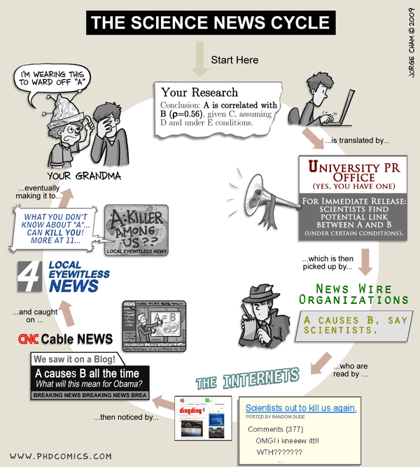
The comic shows how (in the science world) an innocent and valid correlation study conducted in a university lab, with all the proper controls and exceptions included, gets stripped of all its qualifiers and becomes “Proof that A leads to B!” as it moves across the Internet.
The same is all too common in the SEO and Internet marketing business. On an almost daily basis hot news sites proclaim “A causes B! Change your SEO strategy NOW!!!” based on the loosest of correlative relationships.
I for one think that correlation studies, done well and with all proper qualifiers noted, have their value. In some sense, all studies are correlation studies, just to varying degrees. The only way to absolutely prove something would be to have exhaustive knowledge of all possible data points. Thankfully, such knowledge is not necessary in order to establish something as “true.” The correlation just has to be high enough, with a significant number of other variables controlled for, to establish a fact.
But even more tentative or initial correlation studies can be valuable. They can point us in directions most profitable to explore, tell us in what range the “truth” probably exists. In the best possible world, such studies lead to more data-intensive, well-controlled studies upon which we can act with confidence.
Danger, Will Robinson!
But as the comic above points out, it is all too common for PR departments and news outlets to simplify complex and nuanced studies down to a simple, catchy headline. (“Breathing Air Causes Cancer!”). Savvy SEOs and marketers know to look at proof claims with healthy skepticism and ask, “What’s the data behind this? Are there other factors that could be affecting these results that aren’t being covered?”
Case Study: Best Times to Tweet
There have been many “studies” purporting to show the best times to tweet on Twitter (i.e., the times when one would supposedly get the most clicks and/or retweets). Take for example “The Best Times to Tweet: An Essential Guide.” The author states (emphasis mine):
According to the “Twitter vs. time infographic” by Lemon.ly, most traffic on Twitter occurs between 9-11 a.m. and 1-3 p.m. EST. According to Dan Zarrella’s research, the best time to tweet is 5 p.m. EST.
The takeaway: Tweet throughout the day, with an emphasis toward later in the day.
Wait a minute. Let’s break down what we’re seeing here:
- Conclusions of two different studies that don’t show the same results.
- Further investigation reveals that the two studies are measuring two entirely different things (see below). One is measuring traffic of tweets, the other the number of retweets.
- Vague recommendation (“tweet throughout the day, with an emphasis toward later in the day”) not supported by the quoted studies.
- It is not clear why it is “best” to tweet during the recommended times. The thought seems to be that the more people on Twitter at a given moment, the more potential reach your tweet has. But are these times truly the best for all users? Does this automatically mean that more of my followers will be on Twitter at those times?
Things get even murkier when we look at the studies being cited.
Twitter vs. Time Infographic by Lemon.ly
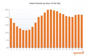
The infographic (linked above) states that the “most traffic on Twitter occurs between 9-11 a.m. and 1-3 p.m. EST.” At the bottom of the infographic, only two sources are listed: blog.twitter.com and http://www.sysomos.com/insidetwitter/. I searched the Twitter blog and could find no data on time of day traffic, so I have to assume they were using the latter reference (which does have such data). But here’s the data chart from the sysomos study:
Traffic does indeed reach a peak from 11 a.m. to 3 p.m. but why was the noon hour left out in the Lemon.ly infographic? Moreover, the “highest traffic” designation is somewhat arbitrary. One could just as easily look at this graph and say “the noon hour is the best hour to tweet” or “it’s best to tweet from 9 a.m. to 11 p.m.” Also look at the scale (percent of all tweets). While there are ups and downs in the tweet volume, the difference between the lows and highs from 9 a.m. to 11 p.m. is at most 1%. Is that enough difference to make a difference to you in terms of your Twitter following’s patterns? Doubtful.
But it’s a lot easier to just run with an attractive infographic than to dig into the data behind it. And thanks to Pinterest, it’s a lot more attractive to share such infographics.
Dan Zarella: Best Time to Tweet
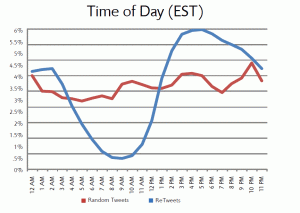
The second source for the original blog post we looked at above was Hubspot.com’s Dan Zarrella. The link is to an hour-long webinar, which I wasn’t going to register for and listen to just for this blog post, but with a little digging I found a post from Dan giving the data he uses in the webinar. Here is his data chart:
As Dan noted in his post, the peak time for retweets seemed to be 4 p.m. (not 5 p.m., as our original post said).
Bill Paarlberg of The Measurement Standard asks a good question about this data:
Myself, I am thinking that to aggregate thousands of post and tweets only scratches the surface, and might hide some important trends. For instance, maybe tweets peak at 4pm because of after-work recreation planning. If we could pull out all the pub/gym/dinner plans, maybe we’d get a very different distribution.
In other words, unless you’re a pub owner or run a gym, the data about when all retweets peak may not be applicable to you.
I could cite dozens and dozens of examples of such leaps to conclusions. Sometimes at least they include some kind of weak disclaimer like “there may be some things I’m missing here,” but when their conclusions section is a set of very positively stated bullet points, any disclaimers get lost.
One recent example is “How Does Google+ Impact SEO Performance.” I’ll leave aside the fact that half the post talks about the effect of +1 on CTR, not Google+, and just leave you to explore how large a data set this fellow drew from for his sweeping conclusions at the end of his post.
This is why I signed on to Corey Creed’s Google Plus SEO Testing Network on the day it was launched. Corey is assembling a team of hard-nosed social marketing and SEO professionals who have agreed to participate in well-crafted, well-controlled studies, and who will act as a sort of “peer review” group to help prevent bogus conclusion leaps.
Takeaway: 4 out of 5 successful search marketers approach all studies with healthy skepticism. I saw that on an infographic somewhere, I think.
Like this post? Upvote it at Inbound.org!
Related articles
- Why the Marketing World Needs More Correlation Research (seomoz.org)
- Whiteboard Friday – Correlation, Causation & SEO (seomoz.org)
- Revolutionary study: We prove that tweets do affect rankings (branded3.com)

