What follows is a real life story, I have not changed any of the names because these brands need to be taken out back and given a stern talking too.
Executive Summary: Nobody enters your contest because you make it nearly impossible.
Let me start with full disclosure. My sister works for Budget Rent-a-car, because of this, I always use them. For the most part my experience with the company have been excellent. But as one of the leading car rental brands in the United States I would have thought they could have done better with their latest Facebook promotion/contest.

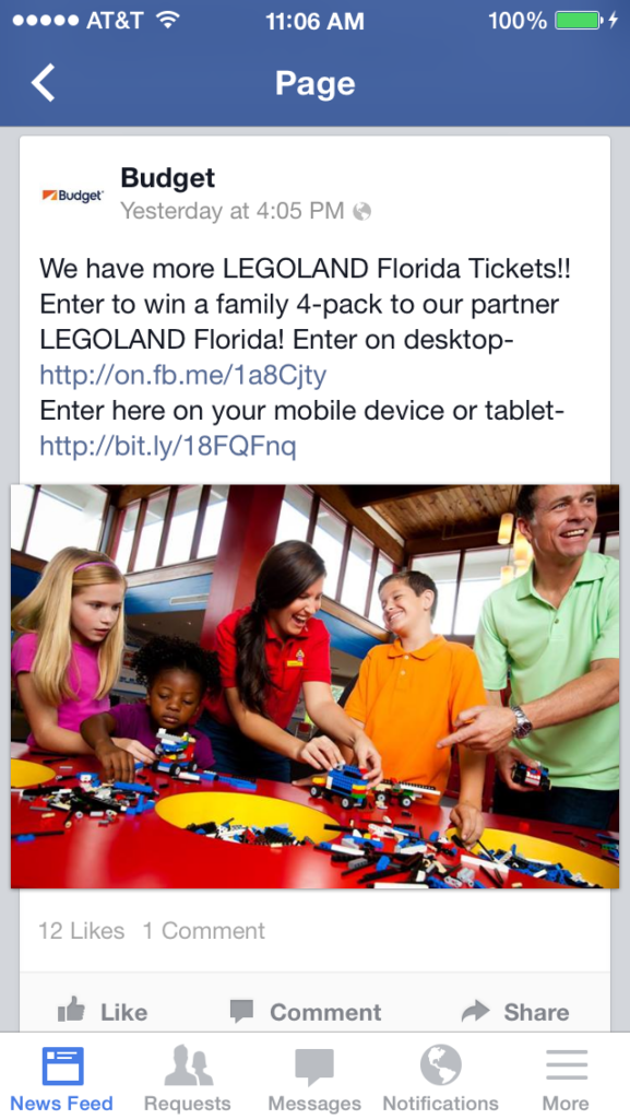
It started out when I saw their post in my news feed Sunday afternoon. My son has been asking about LEGOland, so I was interested in finding out more.
I was impressed that they actually listed 2 landing pages, one for desktop and one for mobile. Very few ads actually have two dedicated landing pages.
The problems started when I clicked on the mobile link.
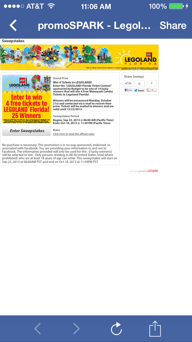
The page that opened was small and hard to read, not what I was expecting for a landing page optimized for mobile devices. There was really two main problems from my point of view.
1. The landing page font was too small.
2. The layout is wide, like it’s made for either a sideways tablet or a traditional desktop monitor.
Mobile optimized usually means phone first, tablet second. It also becomes clear that Budget is using promoSPARK as their Facebook contest platform. I could tell because rather than having Legoland or Budget as the title of the page, they chose to have it promoSPARK – Legoland 3.
I could see the graphical button that said Enter Sweepstakes, so I clicked on that.
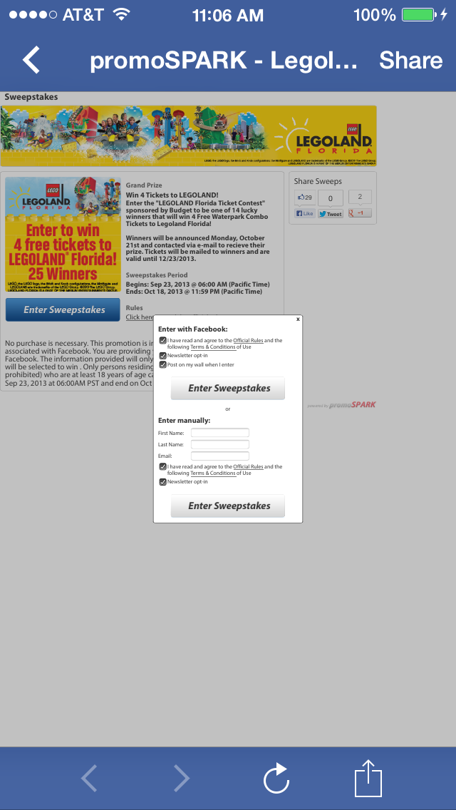
On the list of Things NOT to do on a Mobile Landing Page, I would hope popping up a centered modal window would be listed.
The reason is, when you position the modal window absolutely I can’t pinch and zoom it to fill out the fields because the window disappears out of my viewport as I zoom!
The entry page should have been its own page, the modal window was a bad UX call all around.
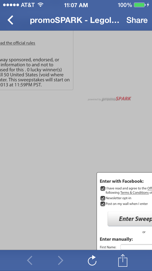
Some of you reading this may have a giant smart phone and maybe you could see the fields, or maybe even a tablet, but on my iPhone 5s it might as well not even existed. So I un-pinched it to start zooming… FAIL.
This whole interaction made me think of what happens when big brands want to appear to be active and hip on social media but aren’t actually putting the resources into it.
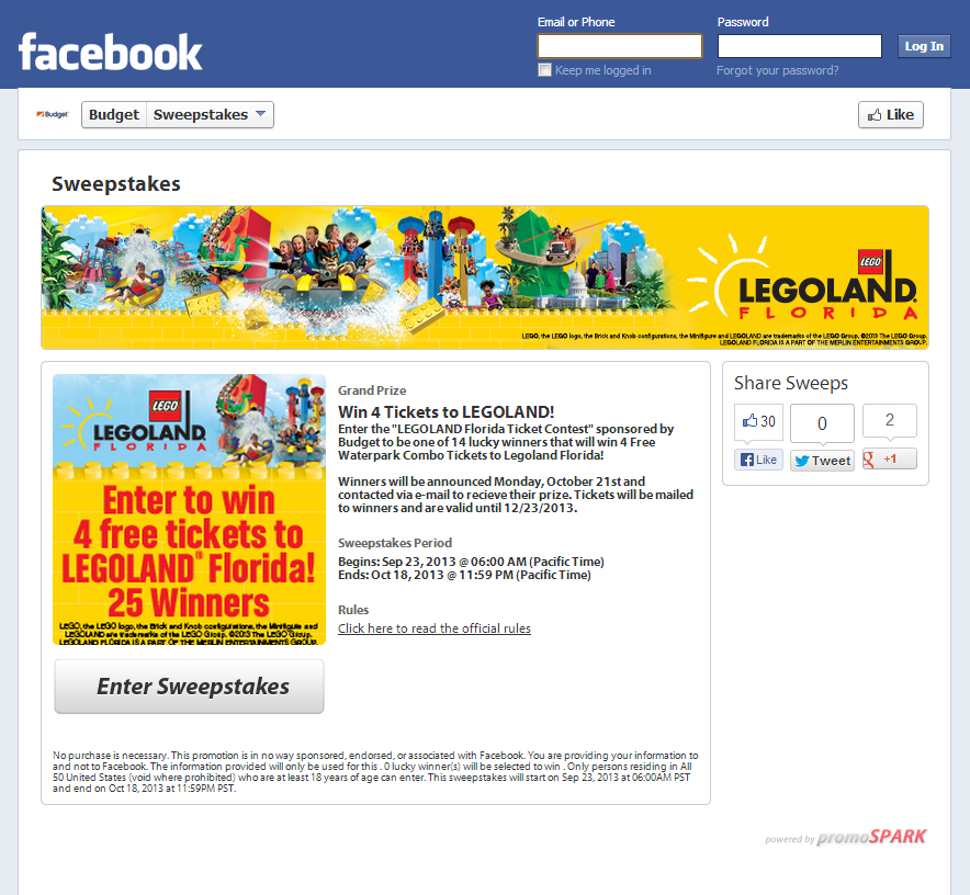
This morning I decided to take a look at the differences between the mobile landing page and the full version (below). Now it all starts to make sense, they didn’t actually make a mobile landing page at all. Budget, or promoSPARK, took a shortcut.
I may be hypersensitive to things like this because a bunch of my friends work at the premier social media agency in the world and help big brands look smart. This is a situation where Budget was trying to get something going on Facebook and the entire interaction was so frustrating that I imagine the drop-off rate must be astronomical.
The lesson here is to optimize for the audience you’re shooting at!
I received a call from Kate Stanley at Budget who told me that she felt bad that I took notice of one of her quick “help someone out” promotions. She explained to me, as Jim Tobin mentions down in the comments, that she relied on promoSPARK to get something up quickly. I know it stinks when someone only takes note of your weakest effort, but that’s the way life is now. Every brand is on display for a billion people to evaluate them every time they engage on Facebook.
I commend Kate for calling and clarify the situation. There aren’t many brand managers that are that on top of things. Although this post probably stings a little bit today, I hope it helps Kate get the support and resources she needs to position Budget as a social media leader.JUMP TO A CATEGORY
WEB ANALYTICS | SEARCH OPTIMIZATION | PAID ADVERTISING | COMPANY NEWS

